5 Tips for Designing Effective BI Dashboards
In technology the most important piece of functionality for any system is the ability to engage with human end-users.
This is true in many aspects of the technology industry, on a personal level IT professionals often excel when communicating more effectively with others, in systems functional concepts such as Graphical-User-Interfaces (i.e. Windows) and a mouse are more accessible to users than command prompts. These concepts are attributable to significant success and technological advancements.
In system design, Business Intelligence capabilities are paramount to successful business adoption. For end-users seeing is believing and in an era where data drives actionable business decisions, effective BI is critical. While there are many tools available to design dashboards and data visualizations, the design considerations of data structures and reporting is really the underlying driver to successful BI Dashboards. Sticking to these 5 key points will put you on the right track for designing effective BI dashboards.
1. Strive for Simplicity
The end goal of a BI Dashboard is to provide summary level information that can be used to drive business decisions. To achieve this larger datasets must be aggregated into a view that can be easily understood by its consumers. The challenge in defining views is sticking to simplicity. People will always ask for more information and more data but realistically we cannot understand or make sense of many details in one view.
To keep it simple try the following guidelines.
Stick to a maximum of four panels in a given dashboard, if you must include a tabular data table limit that to a maximum of two tables where one should still be high-level summary data and the second can include granular details if needed. Make sure you do not exceed four attributes in any given pane.
This guidance may seem anecdotal but there’s actually a history of scientists aiming to measure cognitive capacity and how we consume and retain information i.e. “The magical number seven, plus or minus two”.
Since this is more of an art than a science, the guidance is not rigid. However, it is critical that the dashboards do not contain high complexity as in doing so you will lose focus from the consumer and there will be no ability to drive attention to the data that is most important for the business.
2. Master Visualization Techniques
There are many BI visualization tools available, some third party and some are open-source. It’s important to select the right tool for the job and equally important to understand the best ways to implement BI on any given platform. As a developer, I prefer open-source JavaScript controls like D3. However, this requires significant development effort. Alternatively, if you use a third-party vendor product like Tableau you can spin up dashboards quickly and can quickly tweak dashboards as needed which is often an iterative process. Regardless of what tools you select it’s important to stick to some basic principles for visualization.
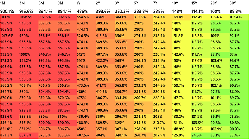
The most important principle in visualization is… We’re attracted to anything big, shiny or colorful. Always be sure to make good use of space and color in dashboards. For example, in tabular data wherever possible include some kind of color coding or heatmap type feature to draw attention to the information that’s important. Typically key information is highlighted in the materiality of numerical values. However, a large number in a grid alongside other numbers does not draw any attention to itself, this is why we need to consider some type of color coding to draw attention where it’s needed.
Standard deviation spike highlighted Yellow and Red based on severity
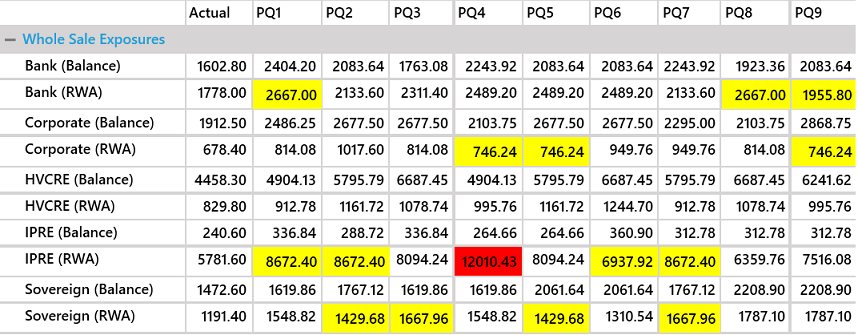
Heatmap of data comparison color coded based on percentage change
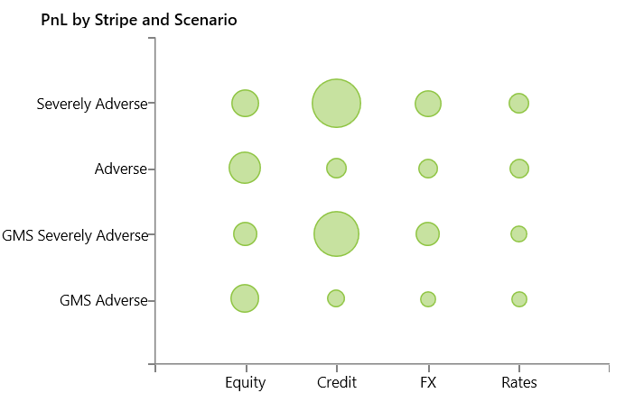
I also find spatial charts such as bubble charts to be very effective. In the case of bubble charts you actually have three different dimensions and your brain kind of takes one for granted as it is visually two dimensional so it’s powerful information but very light on the end users cognitive capacity.
Bubble Chart of Bank Profit and Loss numbers under Economic Stress Scenarios - Highlights loss due to Credit downturn
3. Highlight the Outliers
Flashy visualizations are really not enough unless they’re configured to draw attention to data outliers. Data is not uniform in terms of measures and volume and large spikes in datasets are key in making informed business decisions.
Businesses need to exploit opportunities and mitigate risks; outliers in datasets are exactly the information needed to do this effectively.
Consider generating some additional statistical information on the original dataset. For example, adding standard deviation to any series of categorical values can be very effective. With standard deviation you can rank by highest standard deviation, you can see if numbers are unusually flat and you can find anomalies in the data such as move in excess of three or four standard deviations from the mean which can often point to a significant business event or a technical issue that needs to be addressed.
4. Always include Drilldown
This is something I’ve been burned by in the past. Typically when you’re designing BI or Reports people are convinced they have some well-defined expectation of what to see and this may be coupled with tight timelines to turnaround reports. Turning around the report quickly may seem like some heroic act until it’s presented. At the moment, everything looks great there’s some positive feedback hopefully for hitting the mark with the original requirement and then the consumer asks “What about drilldown?”…about what? This situation naturally occurs in BI implementations.
Always take it as a given that any dashboard should have some capability to drilldown on the underlying results and in conjunction with that users will also judge the quality of the dashboard based on how many clicks it takes to get to the details.
Don’t expect to respond with some explanation of how this information is available in some other view or application or screen etc.
Moving beyond the basics about drilldown, there’s another system design concept that I’ve seen to be very powerful in BI. There’s no official terminology but let’s call it “Loopback”. In this case rather than simply drilling down on a report, you get the ability to “Loopback” to the underlying dataset natively within the system that manages that data. This is very powerful because you can integrate the BI report with the system and users have the ability to immediately perform some action that’s beneficial for the business. i.e.
5. Maintain a clean data warehouse
This is very fundamental to BI and system design. However, in many cases the group that’s designing BI simply inherits a database from a prior implementation and people may feel the data structure is somewhat set in stone or cannot be reconfigured. Do not make this assumption. When designing BI take a step back and think of how the data should be organized and what improvements may be required. If you’re new to this space, a quick google search of Star Schema or Snowflake Schema will result in many tutorials outlining the best practices in data warehousing designs. The key points are to cleanly separate “Fact” tables which contain numerical information vs “Dimension” tables which should contain information attributes about the related fact tables. For those of us with a longer history in BI remember there is a difference between System Databases and Data-warehouses. A system database is geared towards supporting the state of the application code where as a data-warehouse is used to organize this information for BI purposes. If you ignore this and simply start throwing reports together against the systems database you’ll have some unintended results and most likely sloppy reports. Consider designing a data warehouse and implementing some form of ETL to pull from the system to the data warehouse DB. This may seem like a lot of work but it paves the way for effective and faster BI.
In summary, be sure not to lose sight of the fundamentals when designing BI, keep it simple, leverage your visualization tools, aim to highlight outliers, never forget drilldown and maintain a clean dataset. If you keep these concepts in mind you will surely develop some very useful Dashboards and of course if you have any trouble or need assistance feel free to reach out to Autera.
Autera's technology team can take on any ETL, datawarehousing and BI project with ease contact us today.
One-Click Contact